Loan application redesign & multi-site rebuild
Product Designer
UI/UX, Website design, Analytics
AVANA
Sep 2025 – Jan 2026
Web

Collaboration
Stakeholders
Marketing
Project Manager
Engineering
OVERVIEW
AVANA runs three brands — AVANA Capital, AVANA Companies, and AVANA CUSO — serving different audiences but driving to one outcome: a submitted loan application. The form is the revenue moment, so friction there is a pipeline problem.
The loan application form was long, confusing, and missing progress and trust cues, causing drop-off right before submission. I rebuilt it with conditional branching and progressive disclosure, and restructured all three sites around borrower search intent to guide qualified leads to apply faster.
RESULTS & impact
$6.3B+
in requested loan amounts across 791 applications (Sep–Jan)
∼101 → ∼159(+57%)
Avg. monthly submissions, before / after
144 → 177 (+23%)
Monthly applications over 4 months
8.14% → 12.11%
Homepage conversion rate
Deep dive 1
Loan application form
problem
The data made the problem hard to ignore. Between May and September 2025, 2,256 visitors reached the application form — but only 542 of them (24%) started filling it in. Three out of four people who saw the form didn't touch it.
Saw the form - 2,256
Submitted the form - 403 (17.9% of who saw it)
The form looked like a commitment before it was. Questions appeared in no logical order. There was no progress indicator. Fields required for loan processing — not lead qualification — were upfront. Some questions were irrelevant to half of applicants based on loan type. Trust signals were absent. The copy was generic. A borrower evaluating a $5M+ loan at the final step had every reason to abandon before starting.
Discovery
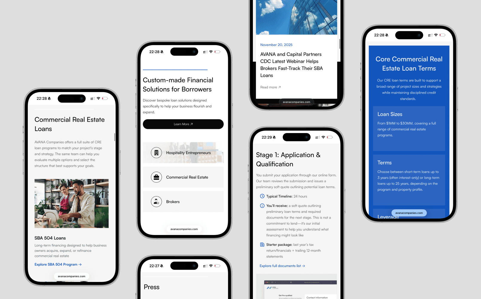
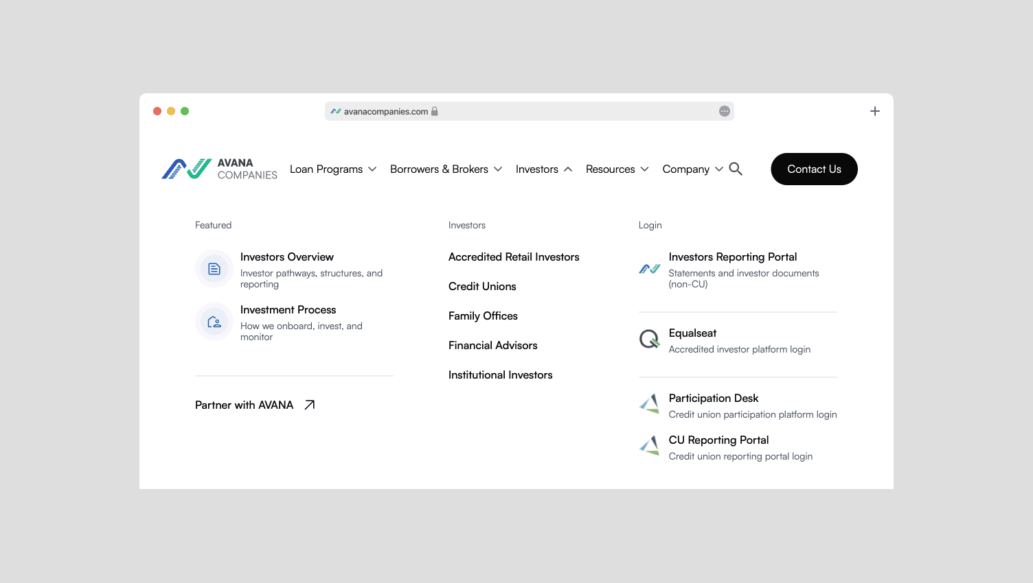
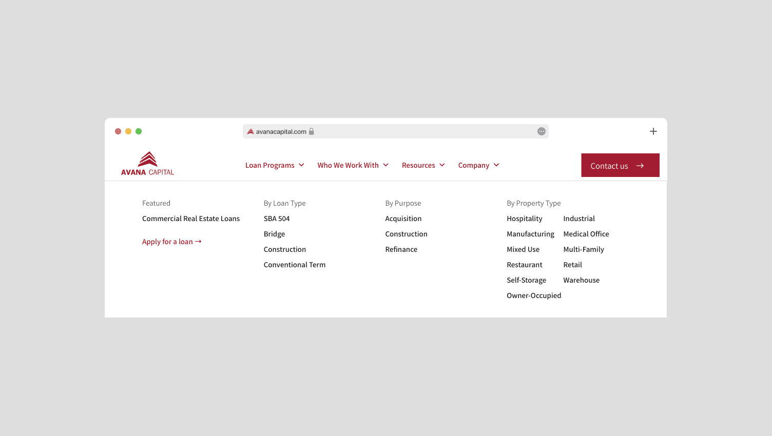
Websites navigation was organized by loan type (how borrowers search)
Strong lenders used progressive disclosure: ask only what’s needed to qualify, defer documentation to later steps
Weaker competitors front-loaded long forms and asked for commitment too early
95% of applications came from three entry groups (roughly equal):
Homepage · Product pages · Blog. These became my three primary conversion targets.
Search was the main acquisition channel. ChatGPT and AI searches were emerging as a smaller but high-intent source — users arriving with more context and stronger intent than typical organic visitors.
Decisions
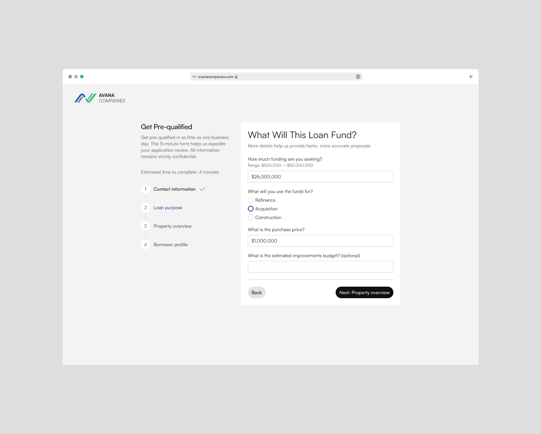
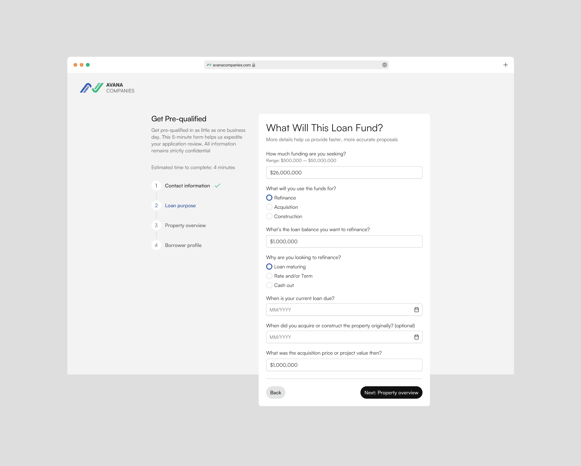
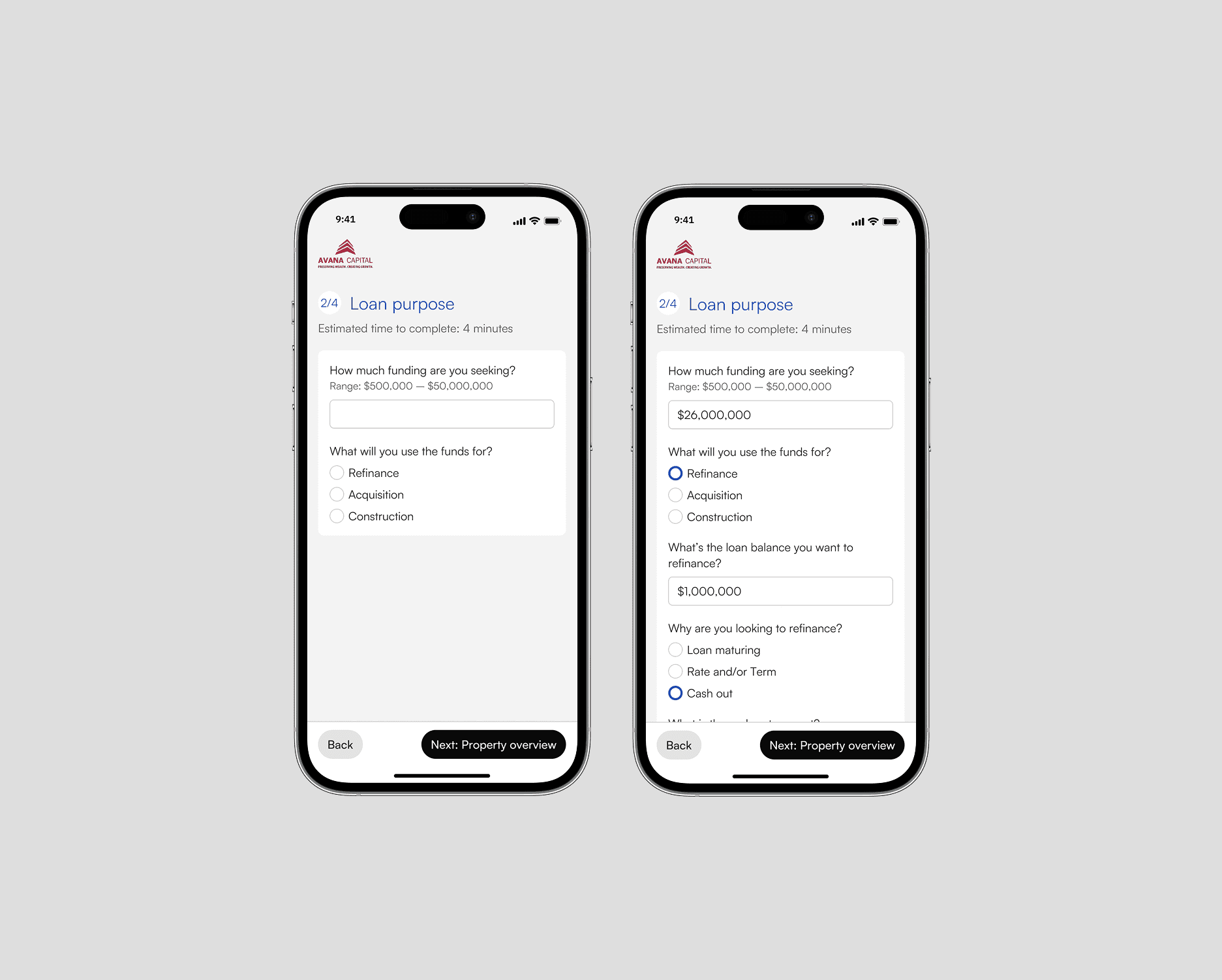
Conditional branching
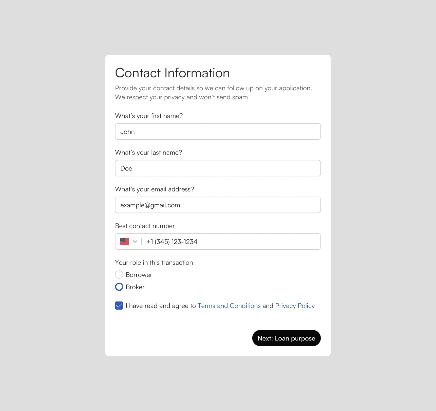
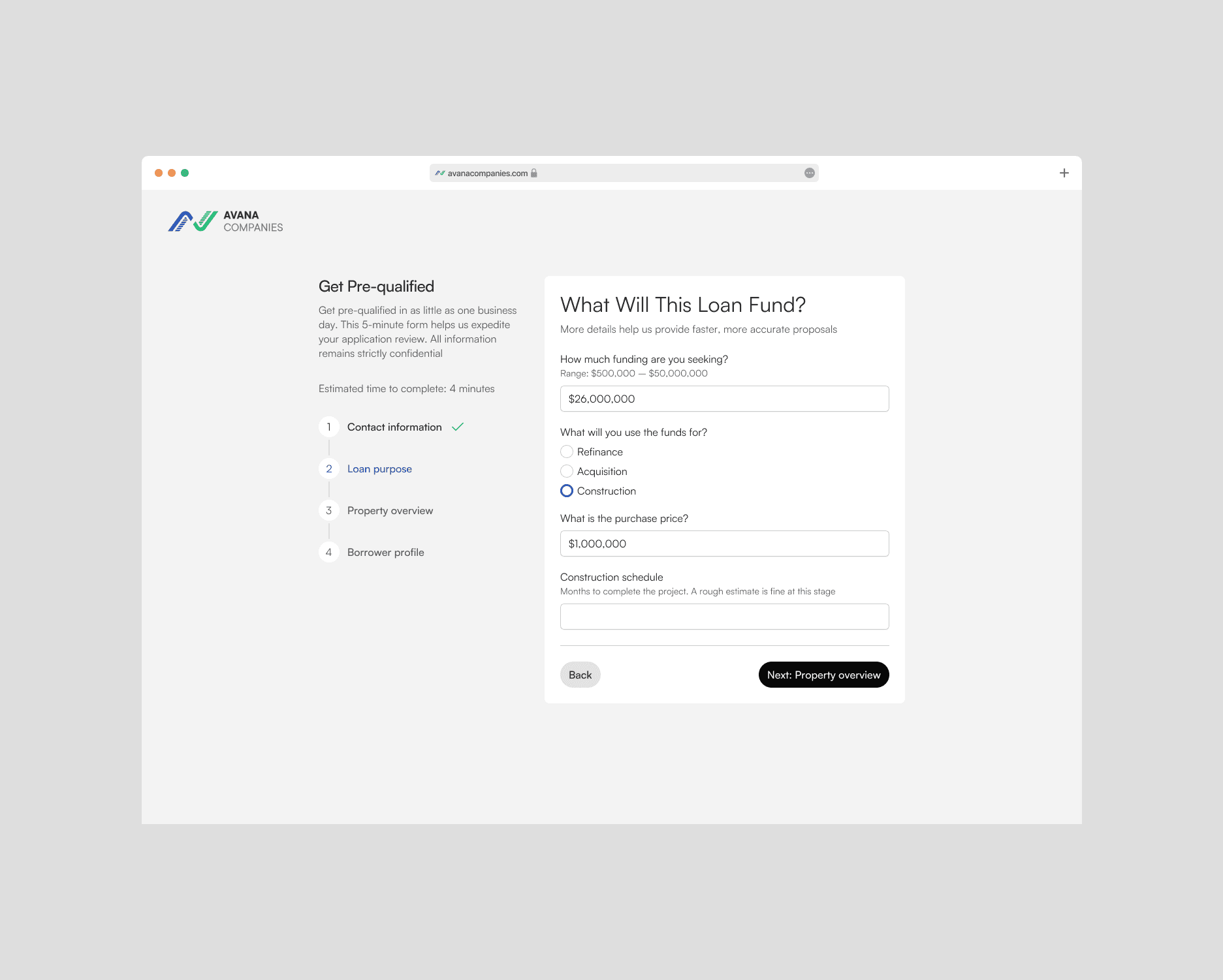
I mapped question sets by loan type and built branching logic so the form only shows what's relevant. This eliminated a large class of confusing, redundant fields structurally
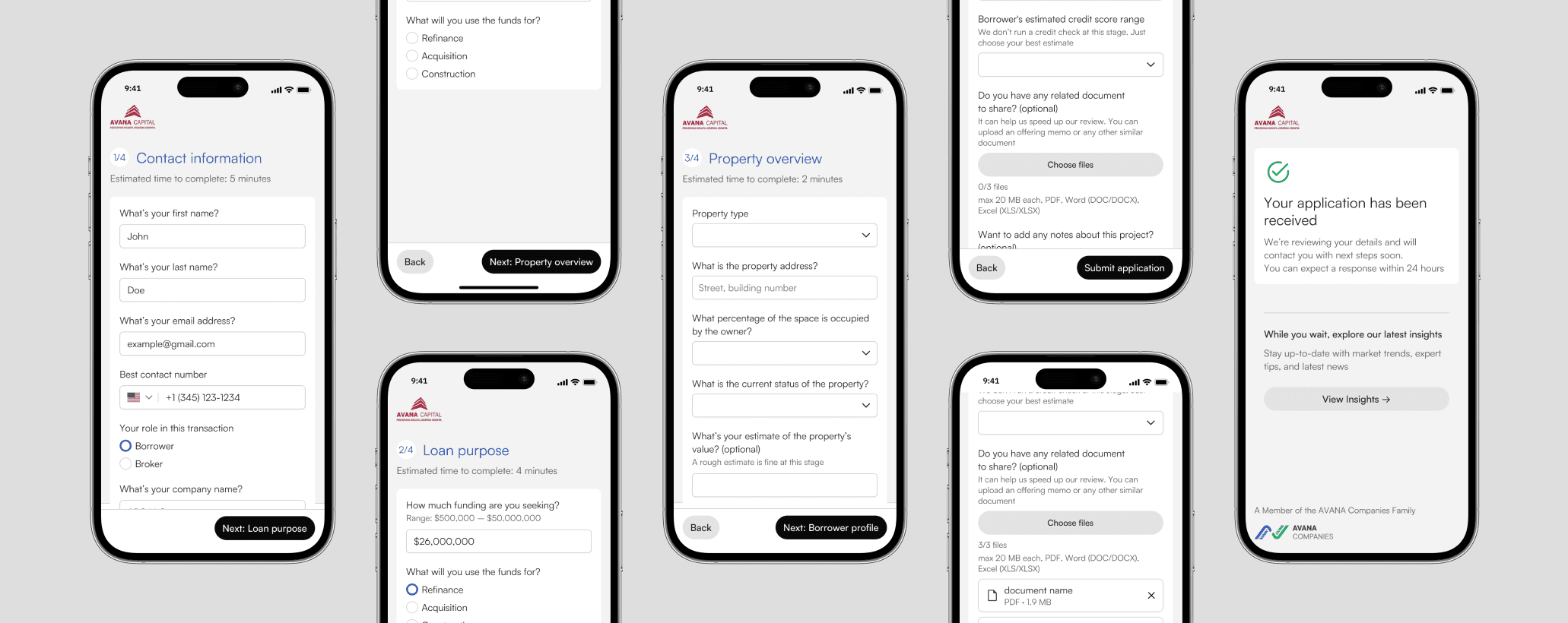
Progress + trust cues to reduce drop-off at high-friction steps
I added a visible step counter and rebuilt the flow around borrower cognition: contact → loan purpose → property overview → borrower profile. Then I layered trust signals exactly where hesitation spikes — security reassurance before submission, credibility/volume stats during the form, and a clear “what happens next” message
Cut “processing” fields and add auto-classification
I audited every field and removed anything needed for loan processing, not lead qualification, making the application shorter. We also added auto-classification to reduce manual sorting time for our team
Form outcome
The form restructure made the application shorter, clearer, and matched to how borrowers actually think about a loan — not how internal teams categorize one.
Form funnel analysis
Sep 2025 – Jan 2026
81.4%
completed Step 2 — Loan Info — after starting the form
67%
reached Step 3 — Property Info — the highest-friction point in the flow
64.1%
submitted a full application after starting
The biggest drop happens between Step 2 and Step 3 — a 14-point gap that marks the next iteration target.
Deep dive 2
Multi-site rebuild
problem
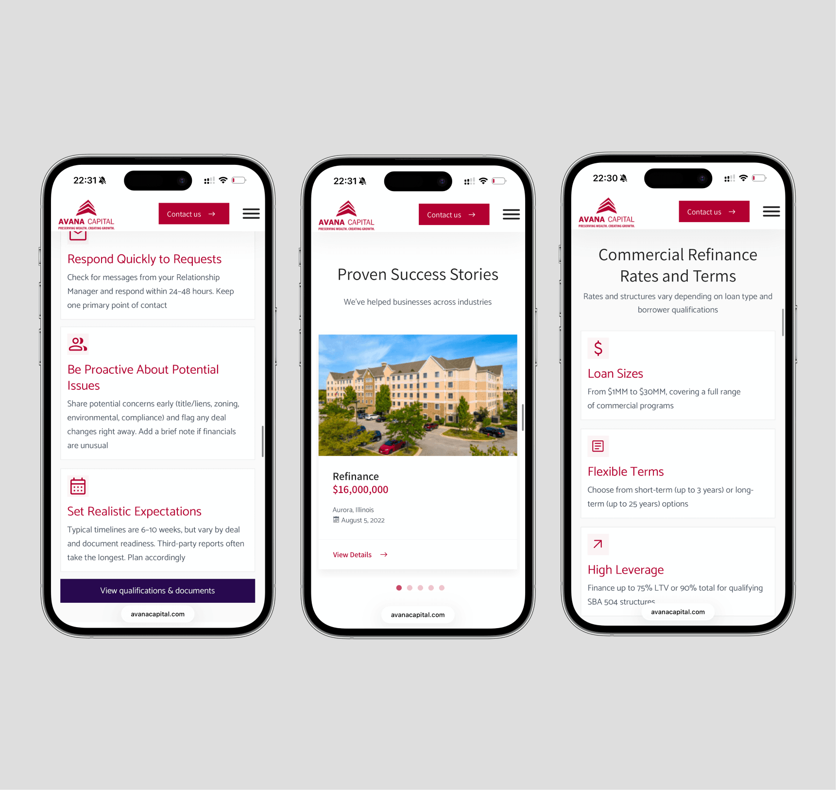
The three sites had grown separately. Navigation structures reflected internal org charts, not borrower search behavior. Page groupings didn't match how borrowers evaluate loan products. Content wasn't organized around the keyword clusters and user paths driving actual traffic.
Information Architecture
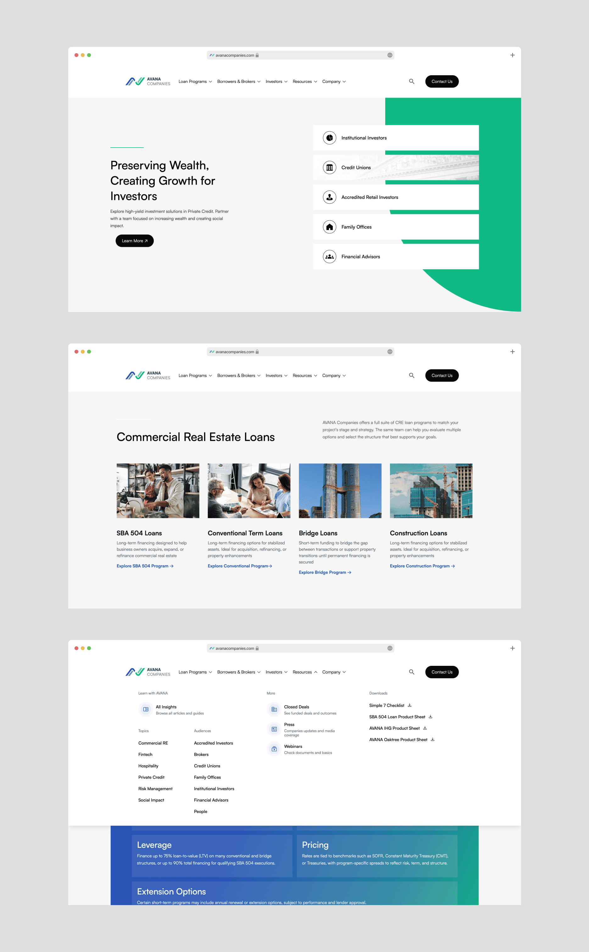
I restructured navigation and page hierarchies across all three sites around a single principle: how borrowers search and decide
SEO Content Strategy
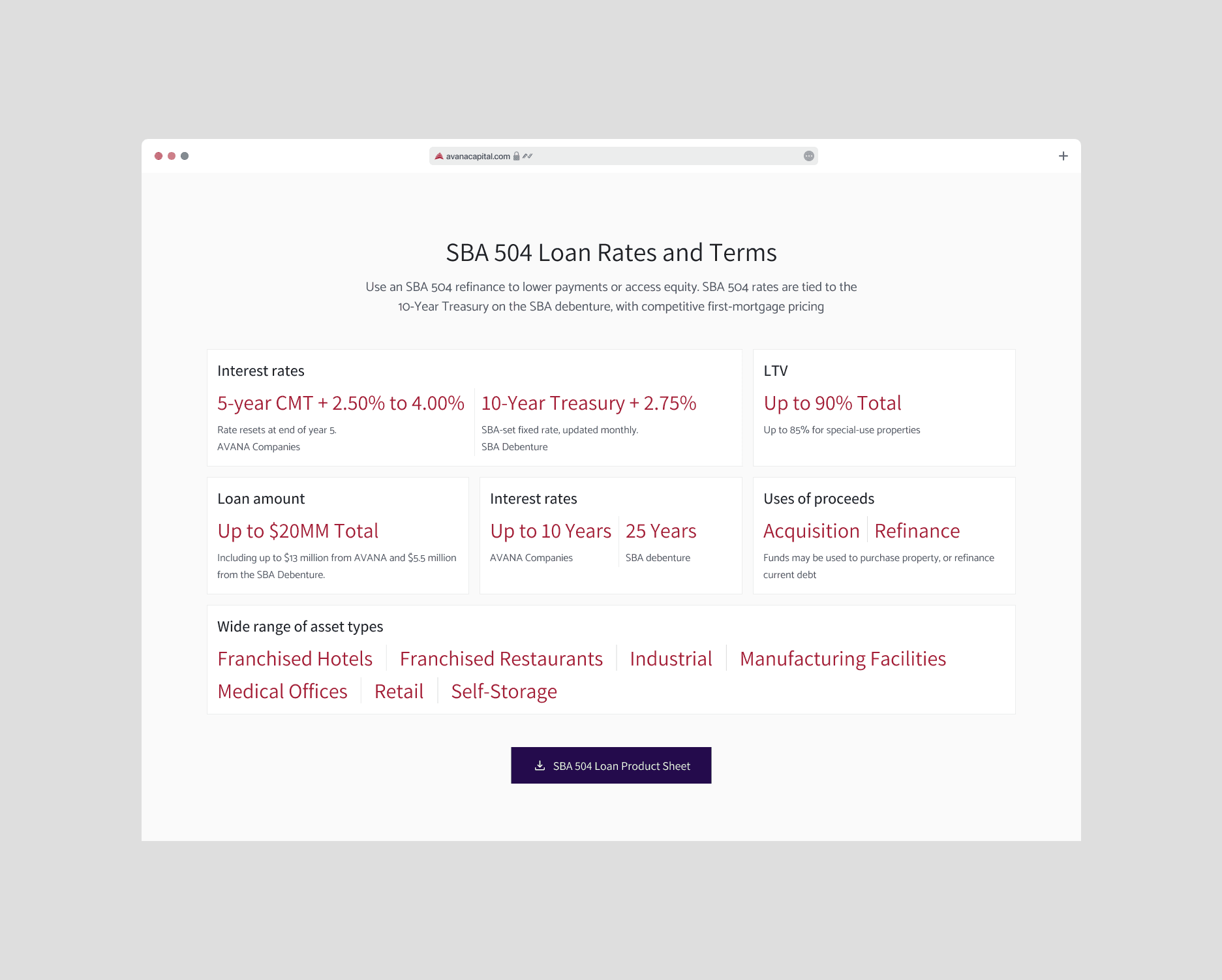
After keyword research across all three domains, I mapped high-priority terms to structurally weighted positions in the page templates: H1s, above-the-fold introductory copy, and internal link anchor text.
The goal was to surface the right page to the right borrower at the right point in their decision journey and then give them a direct path to apply.
Website Outcome
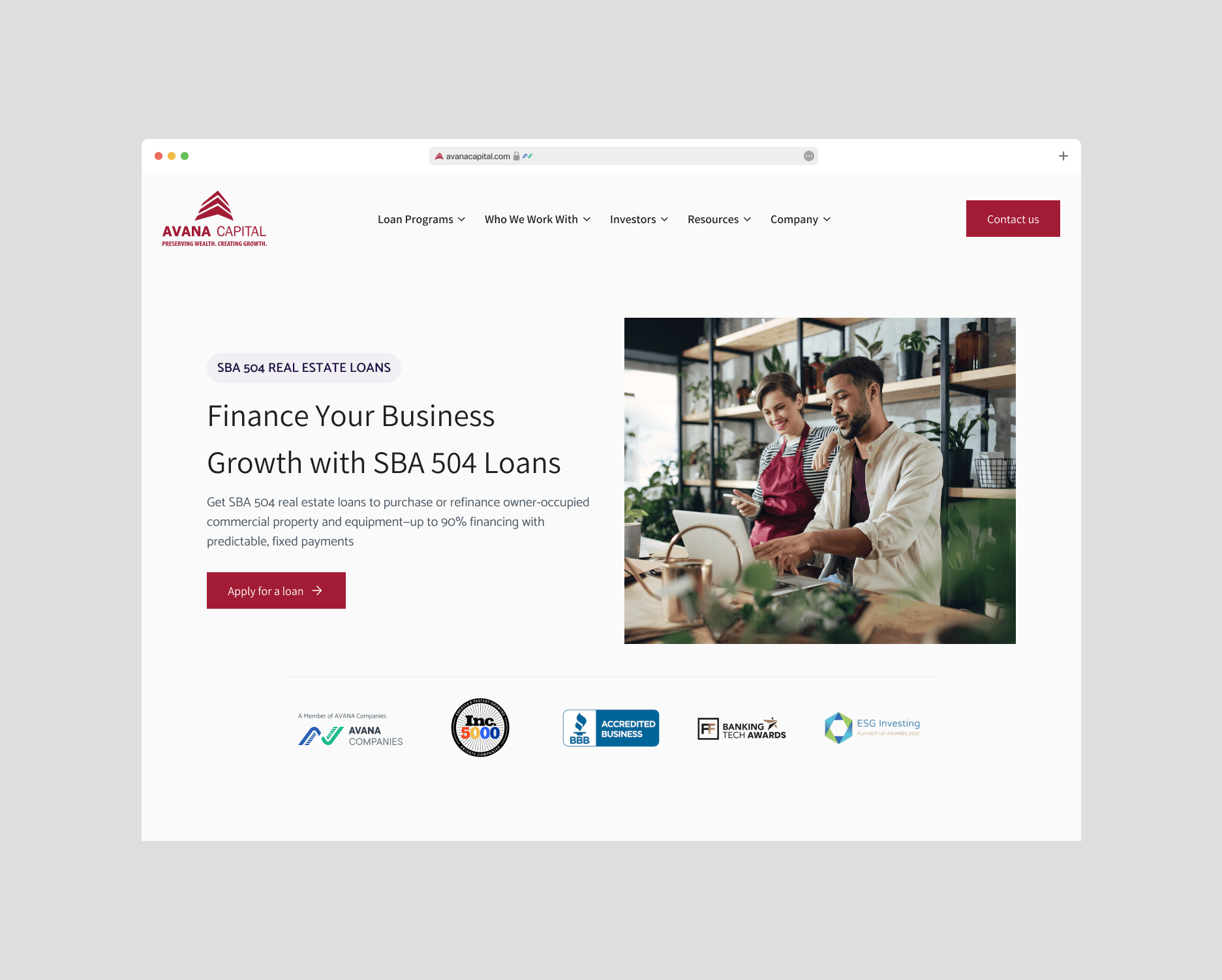
All three sites launched up to Jan 2026. The IA and SEO changes positioned the right content in front of the right borrowers — and gave them a frictionless path to a form that was now actually worth completing.
8.14% → 12.11%
Homepage CR
6.8% → 8.5%
Product page CR
4.13% → 5.07%
Blog CR
Next steps
The redesigned form created something the original never had: clean, step-level funnel data. That data already points to the next problem: the largest drop in the funnel happens at Step 3 (Property Info), where completion falls from 81.4% to 67.0% — a 14-point gap that doesn't exist at any other step. The next iteration is there: either simplify the Property Info step, reorder its fields, or move the heaviest questions to a post-submission follow-up flow.
Because the form now branches conditionally by loan type, we can also test step sequencing independently for bridge loan vs. SBA vs. construction borrowers — something that wasn't possible with the old universal flow.
On the website side: mid-funnel content for borrowers evaluating AVANA against competitors is still thinner than it should be. That's the next content strategy gap worth closing.